Cafe Tilly’s
Reservation Experience Concept Project
Designing a streamlined reservation experience focused on reducing friction and improving usability for café visitors.
Role: UX/UI Designer
Timeline: 1 Month
Tools: Figma, Canva, ChatGPT
The Problem
Many reservation experiences require users to navigate multiple decisions in a short period of time, from selecting a table and arrival time to entering contact information and confirming their booking. Without clear guidance or confirmation, this process can feel overwhelming and uncertain.
This project explored how a streamlined reservation flow could reduce friction and create a more intuitive booking experience.

Mapping the Reservation Journey
Before designing screens, I mapped the complete reservation journey to identify potential friction points, decision moments, and opportunities to simplify the experience.
Users booking reservations often experience:
unclear navigation
too many decisions at once
lack of confirmation clarity
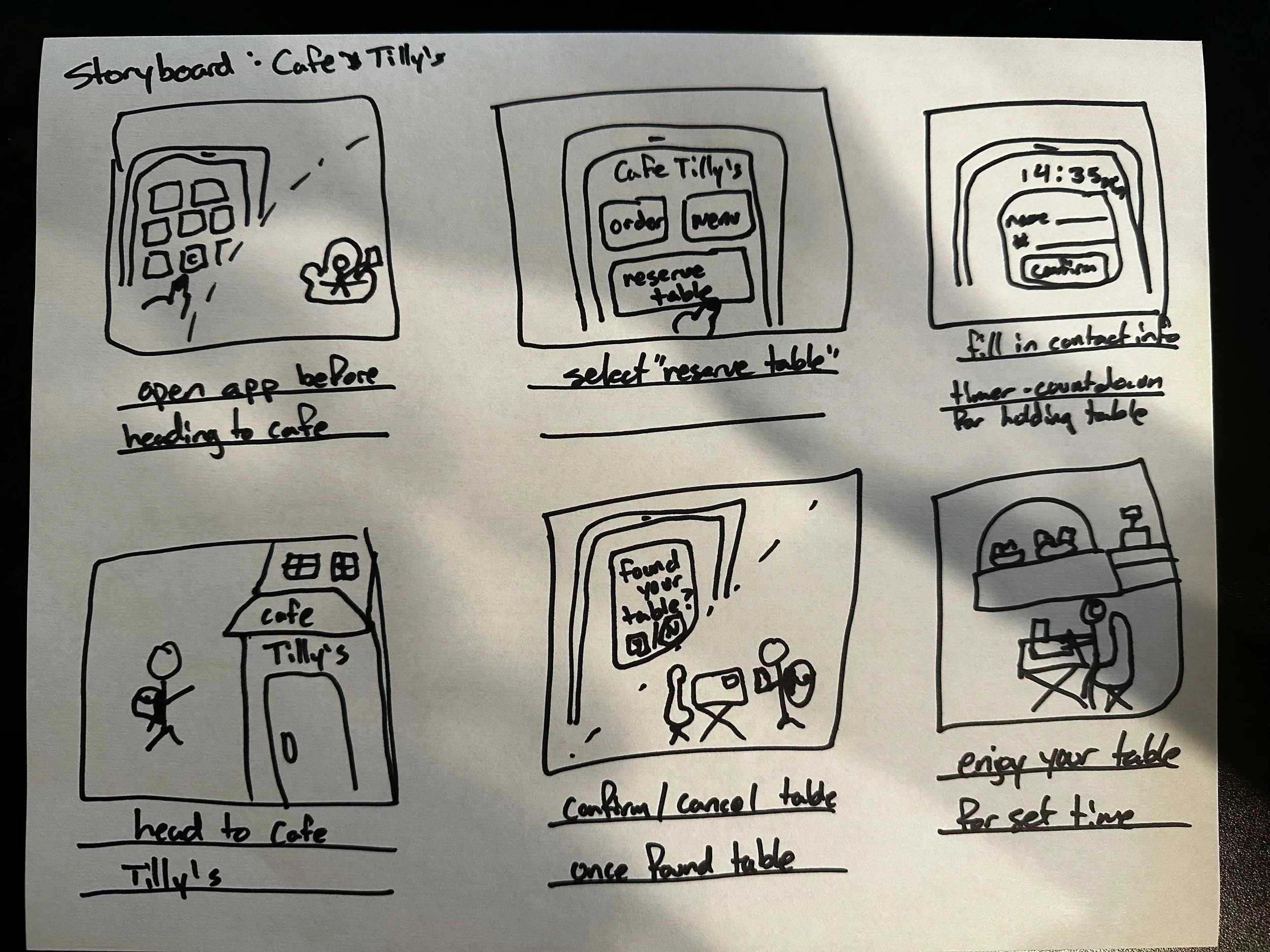
Understanding the User Context
Storyboards helped visualize how users might interact with the experience in real-world situations, ensuring design decisions stayed grounded in user needs and context.

Exploring Reservation Flow Layouts
Multiple reservation flow concepts were explored to evaluate ways to simplify user input, reduce cognitive load, and improve booking clarity.
Design Goals
Simplify Booking
Reduce unnecessary decisions and steps.
Improve Clarity
Provide clear guidance throughout the reservation process.
Build Confidence
Ensure users understand exactly when their reservation is confirmed.
User Flow
After identifying key pain points, I mapped the ideal reservation journey to understand how users would move through the experience and identify opportunities to simplify the booking process.
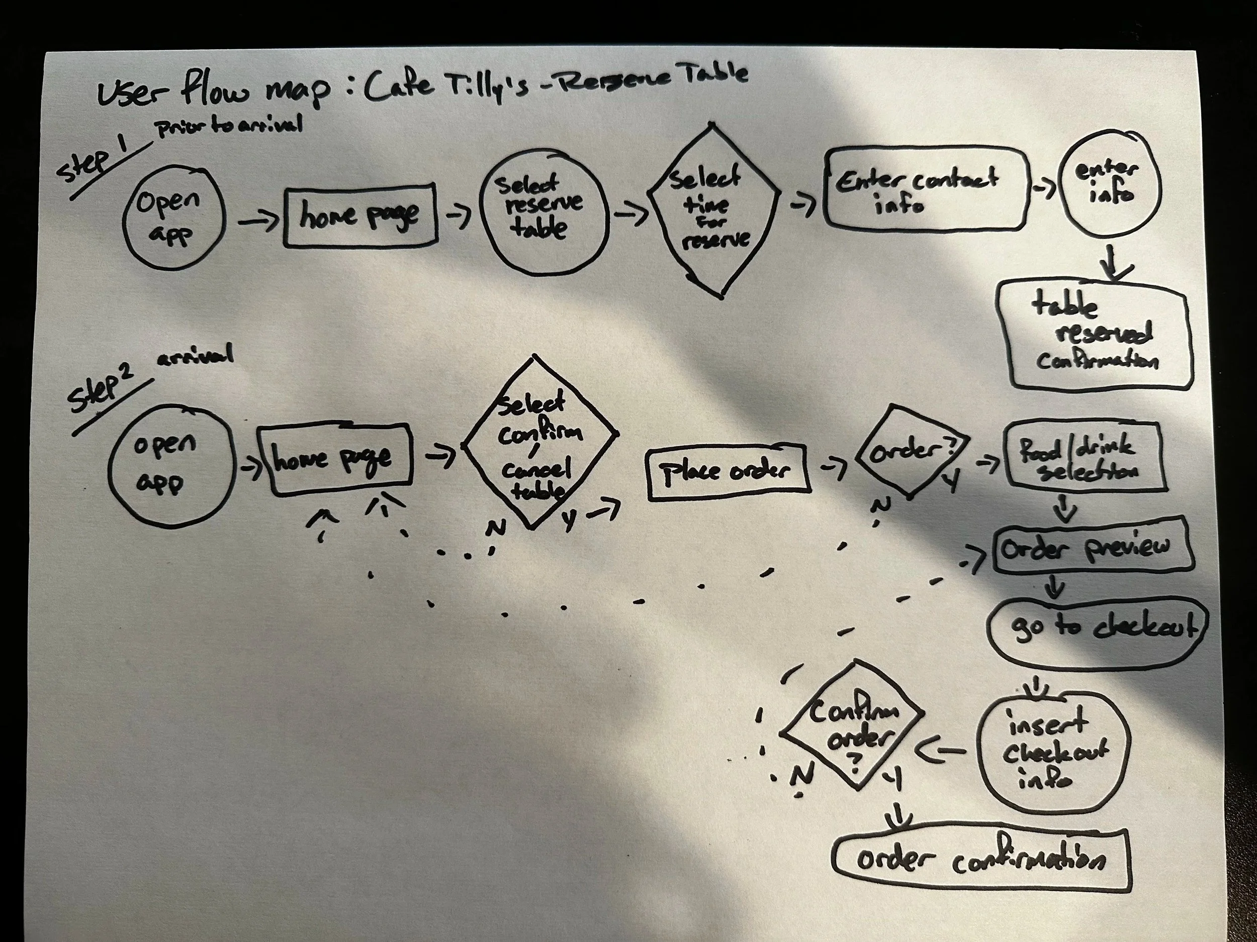
The final flow balanced simplicity and flexibility by allowing users to reserve a table, order ahead, or complete both actions within a single streamlined experience.
Homepage Concepts
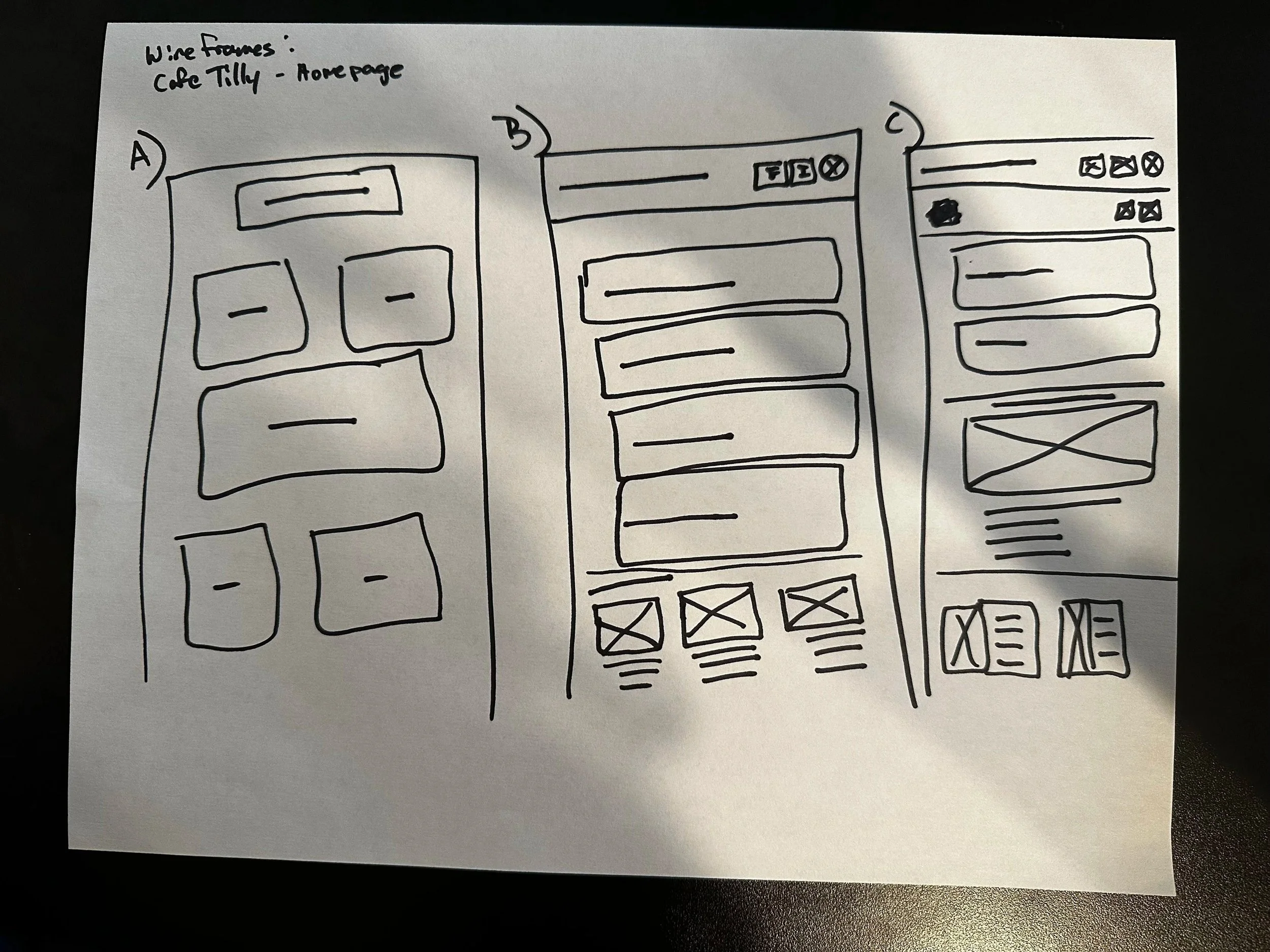
I explored several homepage concepts to determine the most effective information hierarchy and navigation structure while ensuring reservations remained the primary call to action.
Wireframe Exploration
I explored multiple layout variations to evaluate information hierarchy, simplify user input, and improve booking clarity.
Content Prioritization
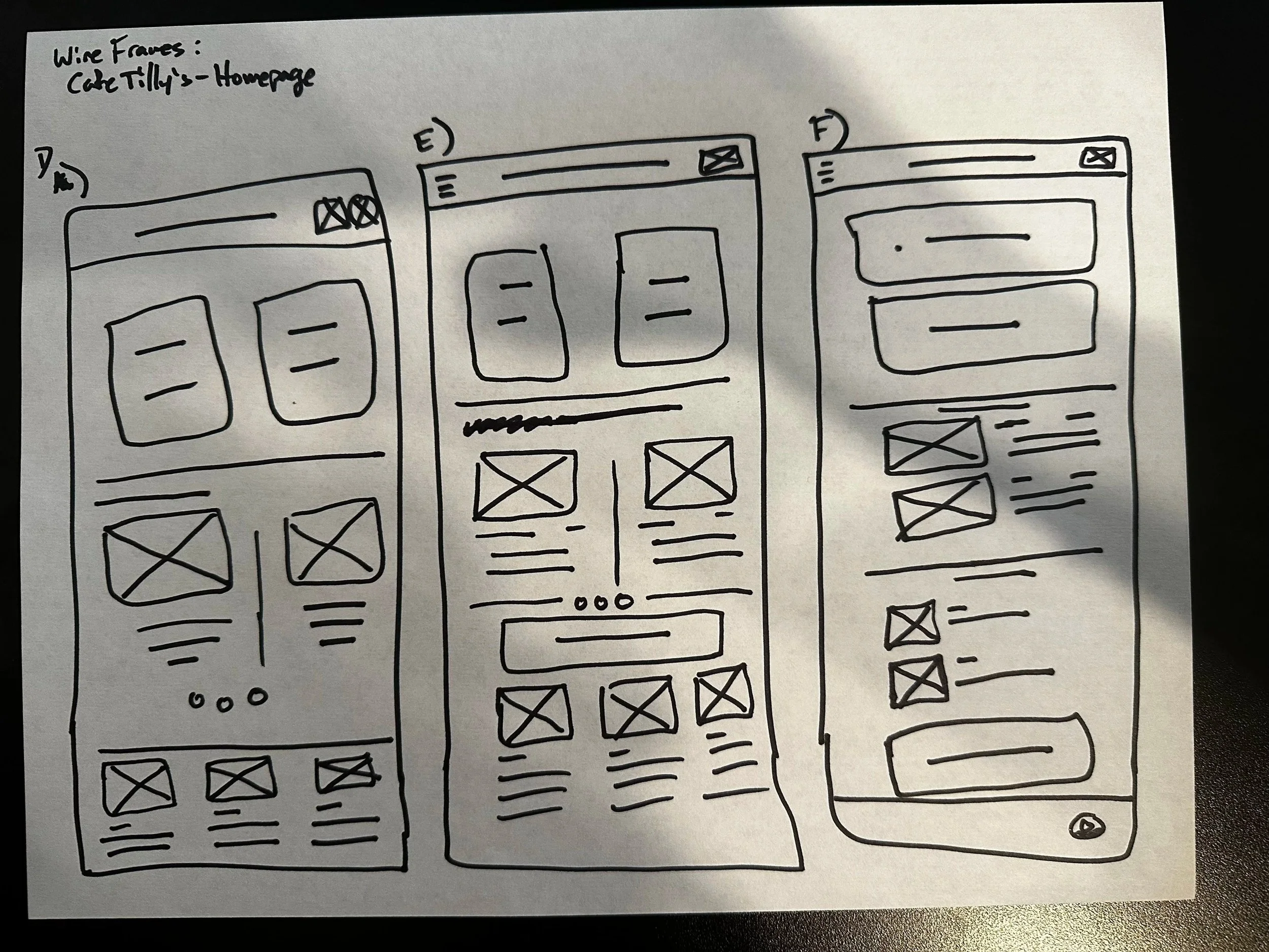
Different layouts were tested to evaluate how content placement could guide attention toward key actions and improve usability without overwhelming users.
Reservation Flow Concepts
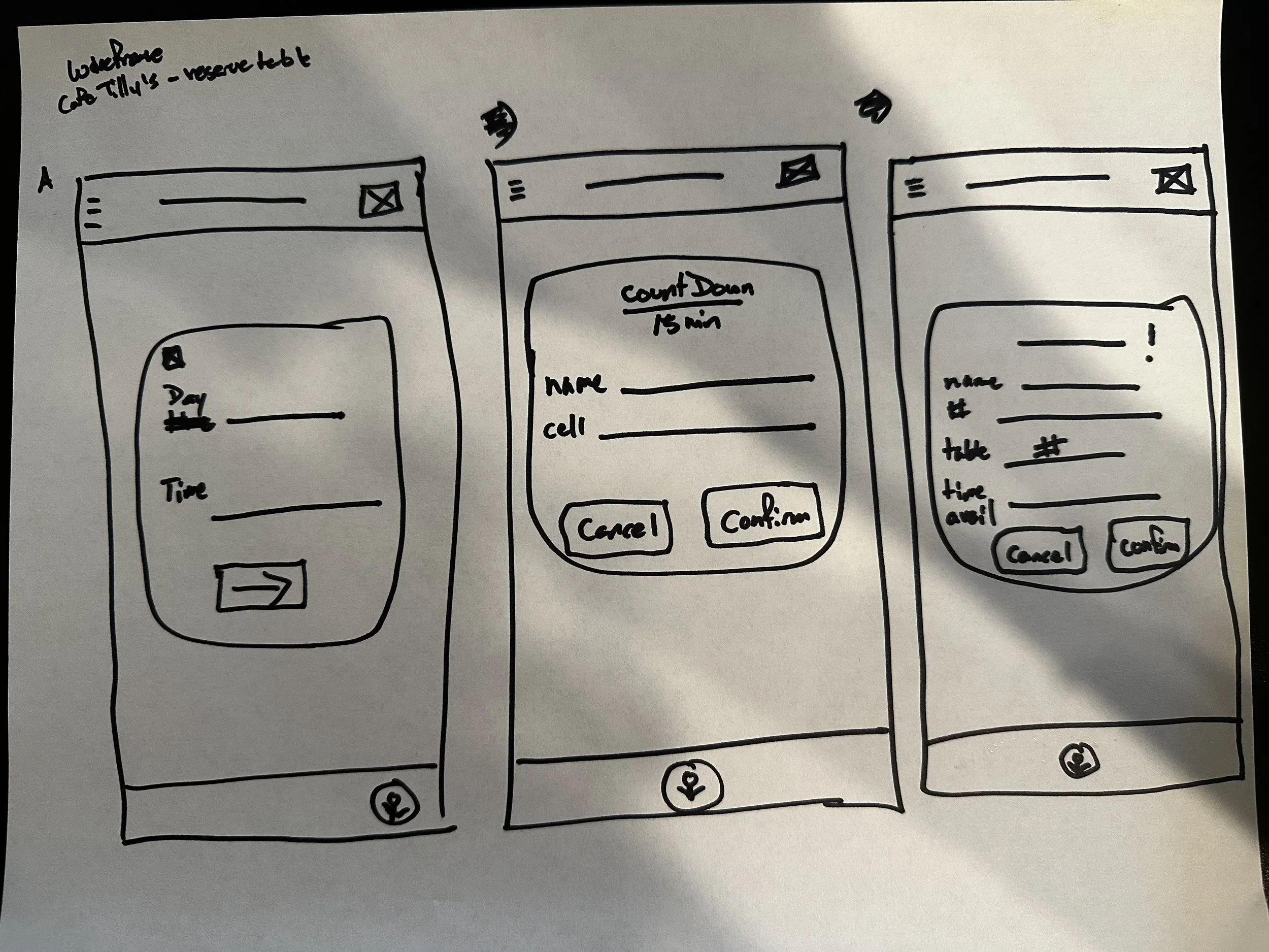
As the project’s MVP, the reservation experience underwent several iterations to simplify booking, reduce friction, and provide clear confirmation throughout the process.
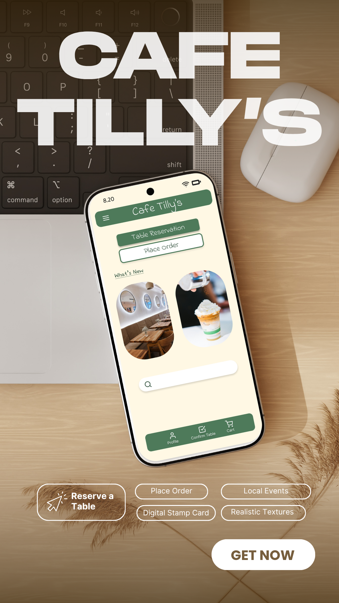
Final Design
The final designs translate research, wireframing, and iteration into a streamlined reservation experience focused on clarity and ease of use.
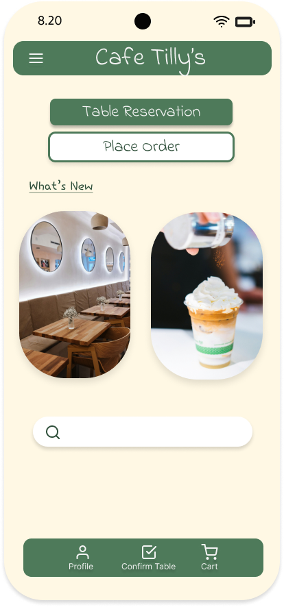
Prioritizing Reservation
Reservations were positioned prominently on the homepage to support the application’s primary user goal and reduce navigation friction.
Simplified Booking Flow
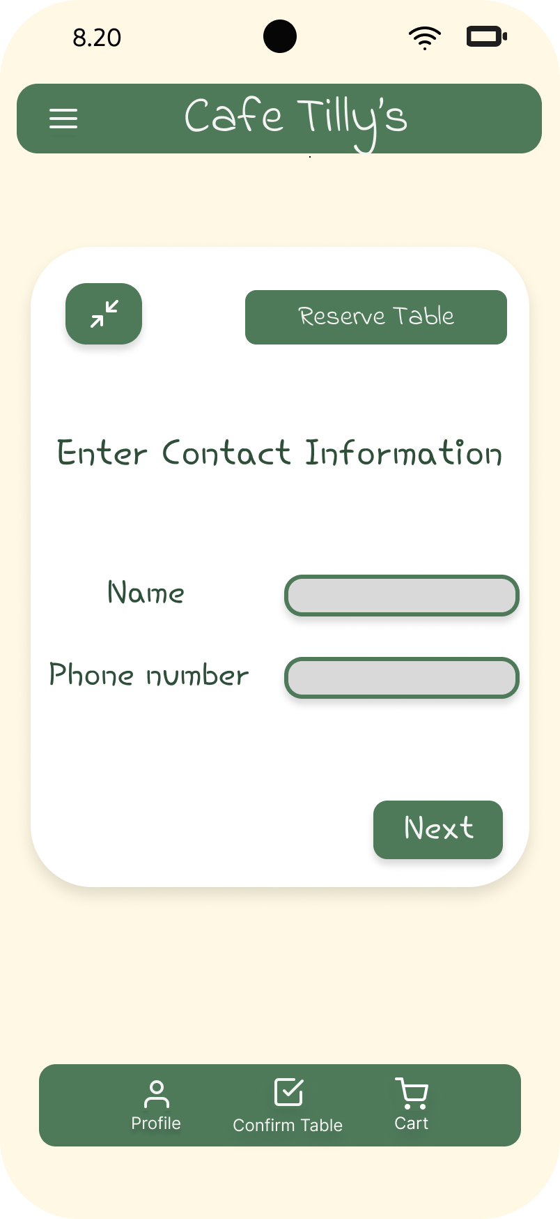
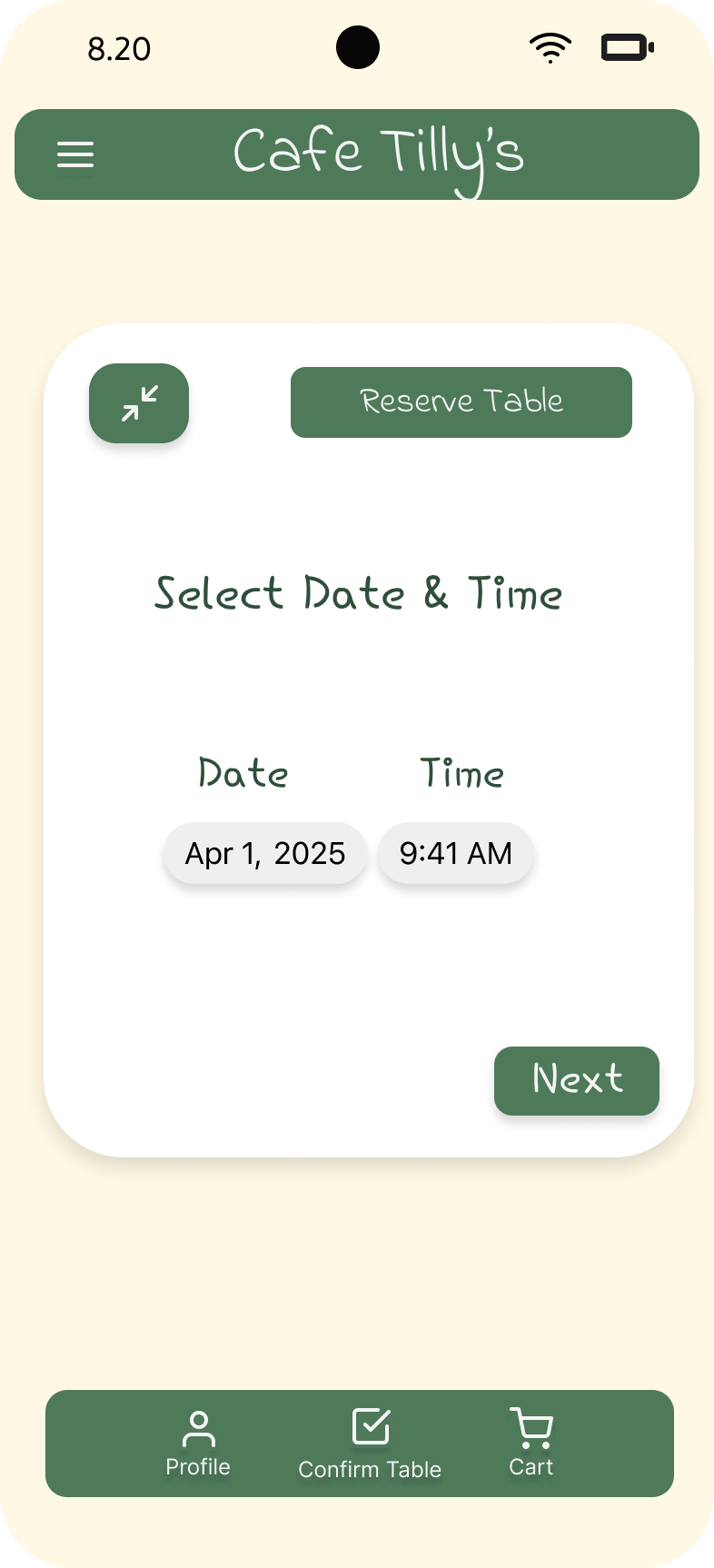
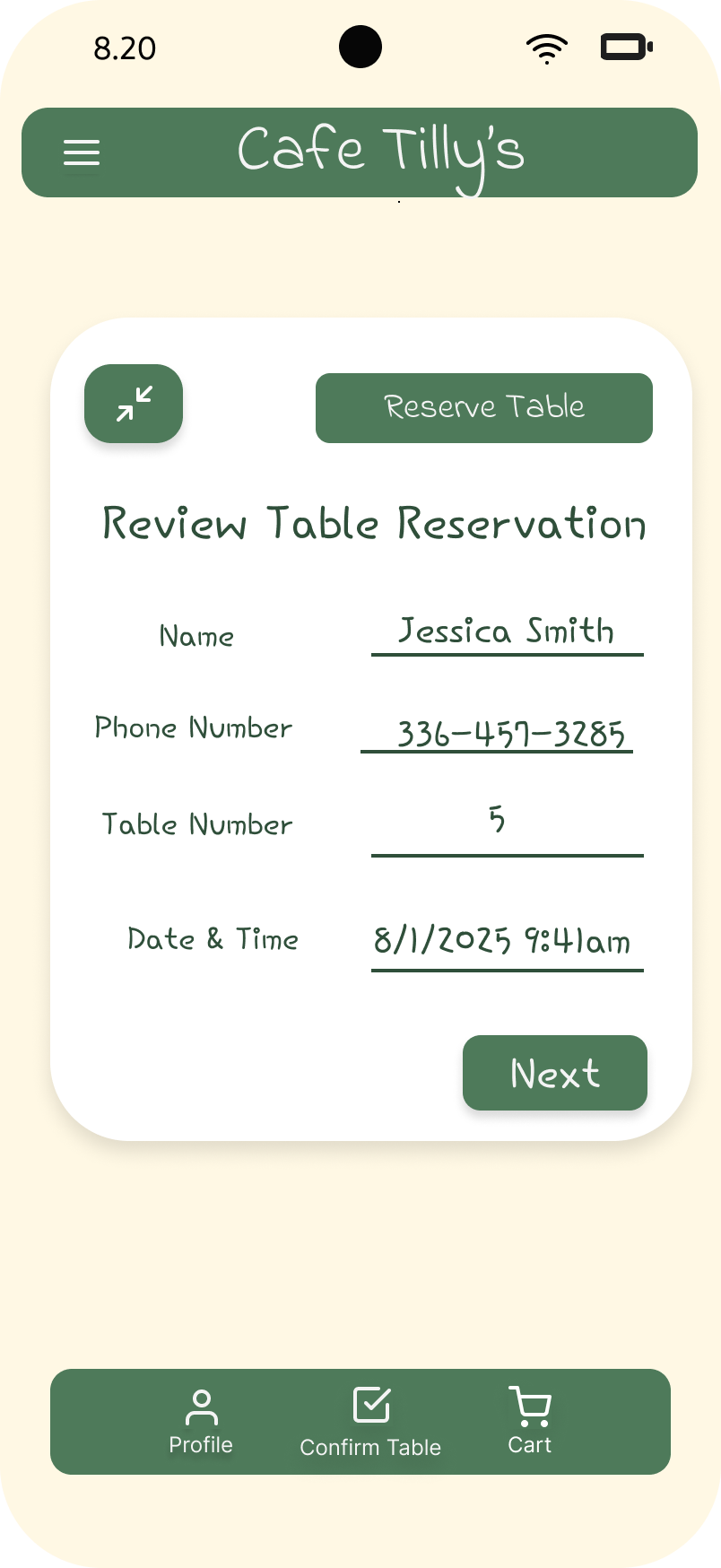
Information was broken into smaller steps to reduce cognitive load and help users complete reservations with confidence.
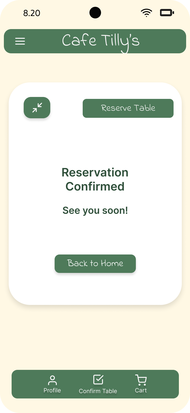
Building User Confidence
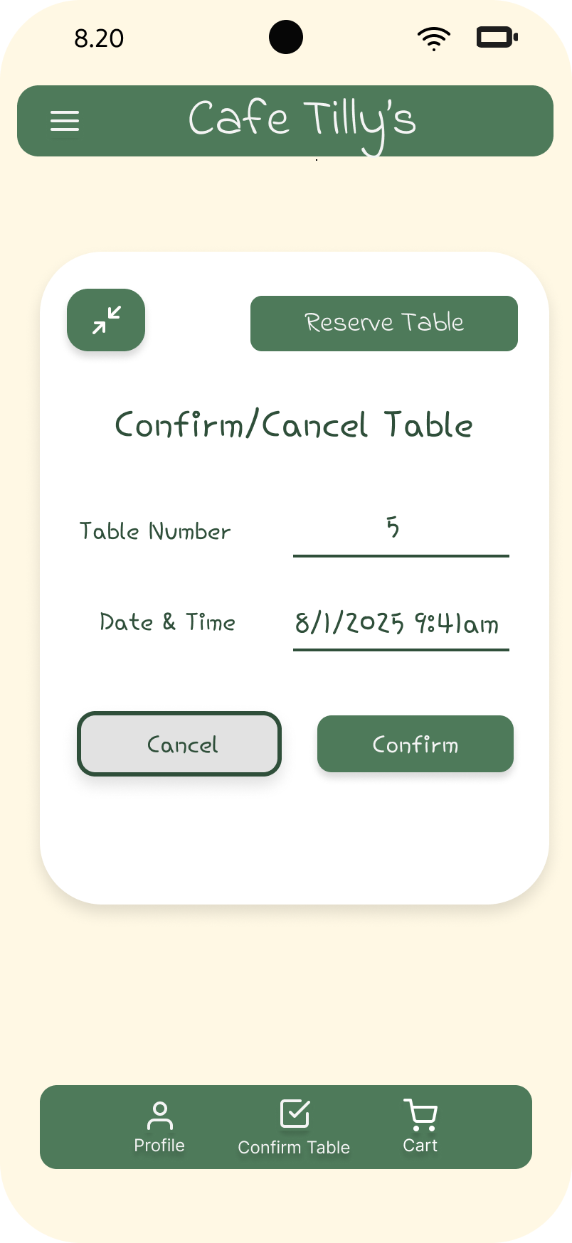
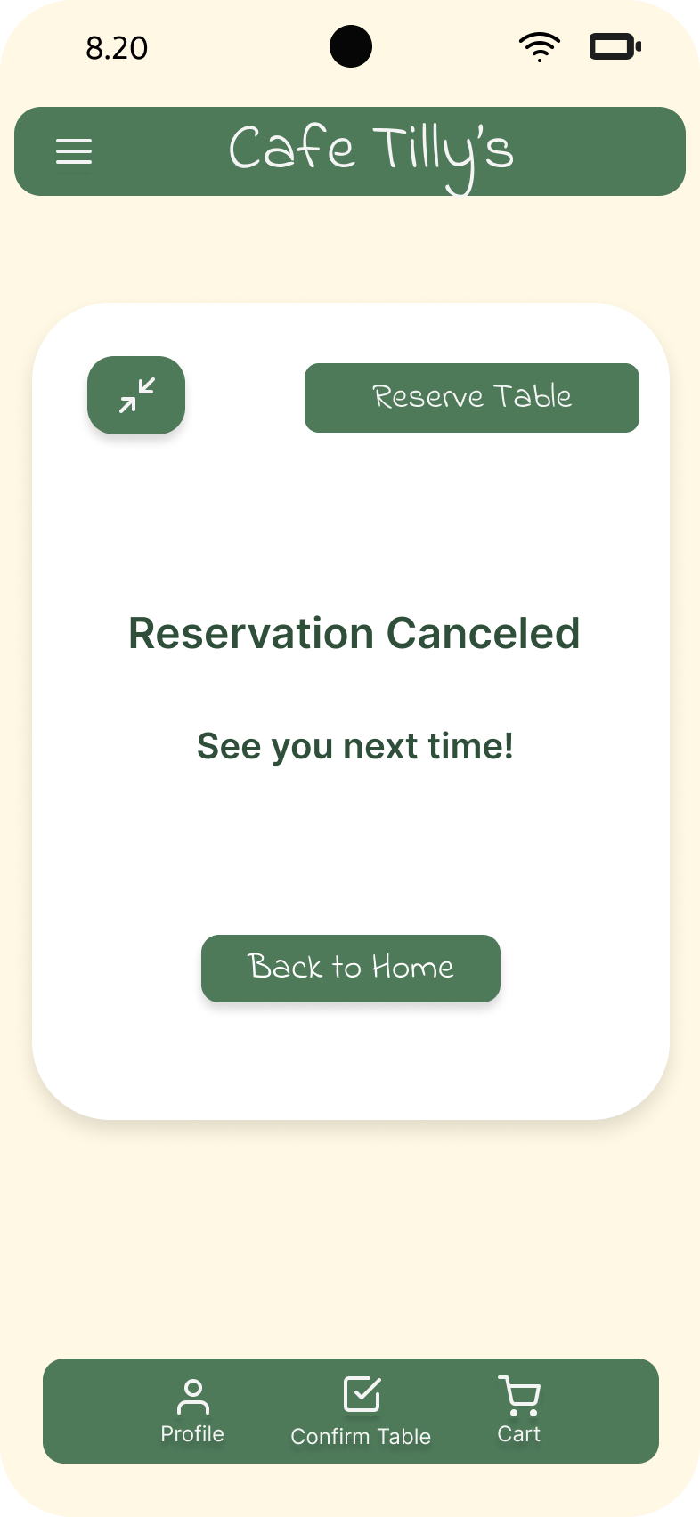
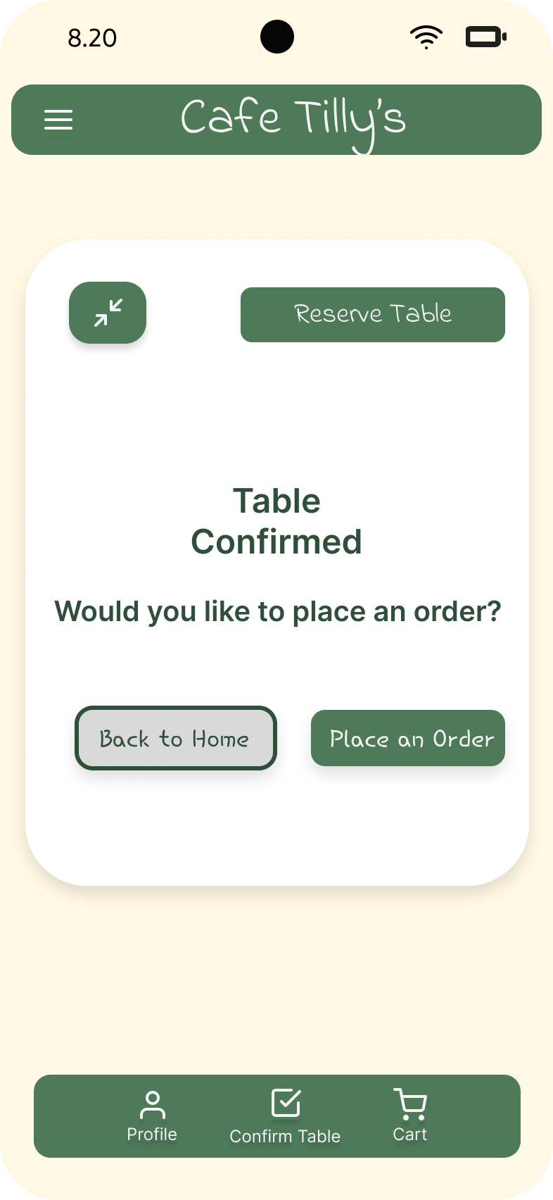
Confirmation and cancellation screens provide immediate feedback, reducing uncertainty and reinforcing user trust.
Reflection
This project strengthened my understanding of user flows, information hierarchy, and designing experiences that balance user needs with business goals. Through multiple rounds of exploration and iteration, I learned the value of simplifying decision-making while maintaining flexibility for users.
Future Improvements
Conduct usability testing
Validate assumptions with real users
Improve accessibility
Expand the ordering experience